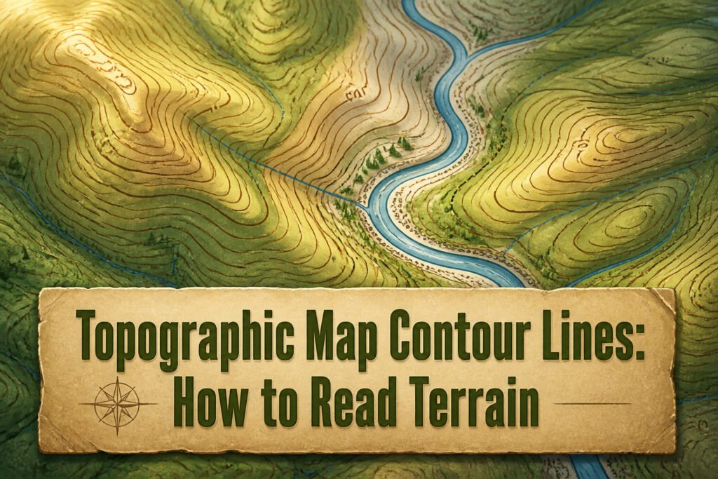
A contour line is a line on a map that connects adjacent points of equal elevation, and reading it wrong will send you up a slope your legs are not ready for. The same tight stack of lines means a cliff on a 20-foot interval map and a steep but walkable grade on a 5-foot one. I once misread the V-shaped bends where lines cross a stream in the Appalachians and walked a ridgeline the wrong direction for twenty minutes before the drainage pattern made sense.
What Contour Lines Actually Are
A contour line is a line on a map that connects adjacent points of equal elevation, and that single definition changes everything about how you read terrain. Unlike shaded relief or color bands that paint whole zones in broad strokes, one contour line traces exactly one height across ridges, valleys, and flat ground alike. The line bends where the land bends, tightens where the slope steepens, and runs straight only when the grade holds steady in one direction.
This precision matters more in a country as varied as this one. The average elevation across the United States sits at 1,014 feet, but that number smooths over everything from coastal plains sitting near sea level to Appalachian peaks around 6,000 feet and the much higher ground beyond. Contour lines let you see those changes in increments you can actually use, not guess at from a color wash.
Why Contour Lines Matter for Terrain
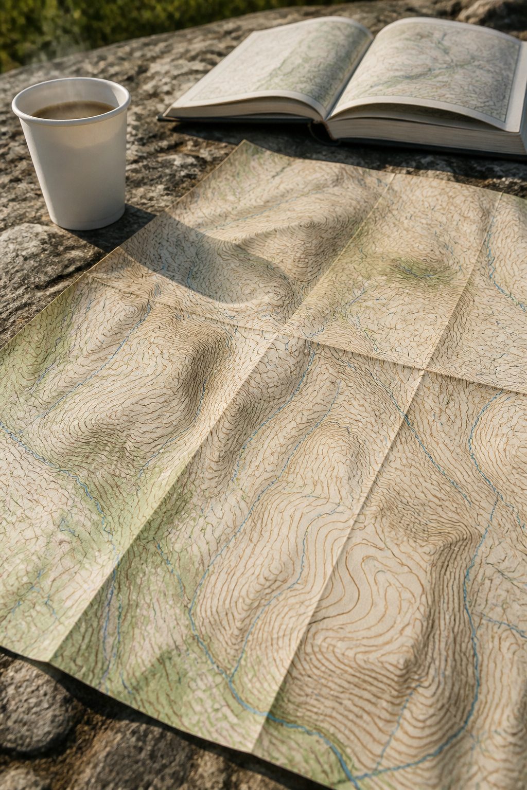
A flat sheet of paper holds no depth until the brown lines start speaking. Contour lines connect points of equal elevation, and that single rule turns a two-dimensional map into readable terrain without a single shaded graphic or digital render. The closer those lines crowd together, the steeper the ground rises; spread them wide and you are looking at a gentle grade you could walk without breaking stride.
What convinced me, reading through the mechanics of this, is how much information sits in pattern alone. A closed loop of contours with no hachures marks a hill or mountain, innermost ring highest. Reverse that with hachured lines and you are staring at a depression or volcanic crater. The "V" rule does the rest: where contour lines cross a stream, the point of that V aims uphill, every time, no compass required.
The contour interval itself, the fixed vertical jump between neighboring lines, gives the map its scale of relief. On the Stowe, Vermont quadrangle, that interval is 20 feet. Hold that number steady across the sheet and the hilliness of any patch becomes immediately comparable to any other. No 3D model, no software, no battery to fail: just line spacing and shape, read right, telling you where your legs will burn and where they will rest.
Contour Interval and How It Changes What You See
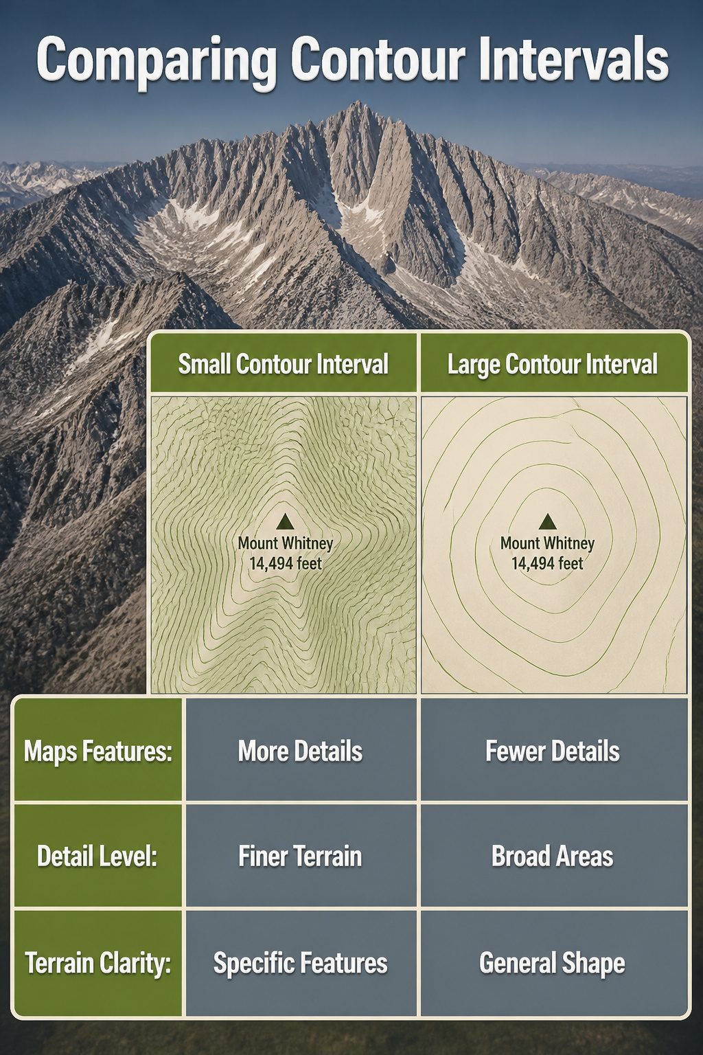
The contour interval is the vertical distance between any two adjacent contour lines on a topographic map. A smaller interval means more lines packed into the same slope, which translates to finer detail about exactly where the ground rises and falls. A larger interval cleans up the picture for broad areas but swallows smaller features whole.
How wide that interval gets depends on the scale of the area being mapped. Larger territories get larger intervals; the mapmaker trades precision for legibility so the page does not turn into spaghetti. There is no universal standard measurement that applies everywhere, so checking the interval printed in the map margin is always worth the few seconds.
Mount Whitney, at 14,494 feet, is a place where that choice really shows. With a generous interval, the summit might sit inside a single bold ring and a few sparse lines below it, telling you it is high and steep but little else. Tighten that interval and the same peak reveals benches, gullies, and the exact ridgeline you would actually walk. The mountain does not change; what you can plan from your kitchen table does.
Reading the Lines: Rules That Keep You Right
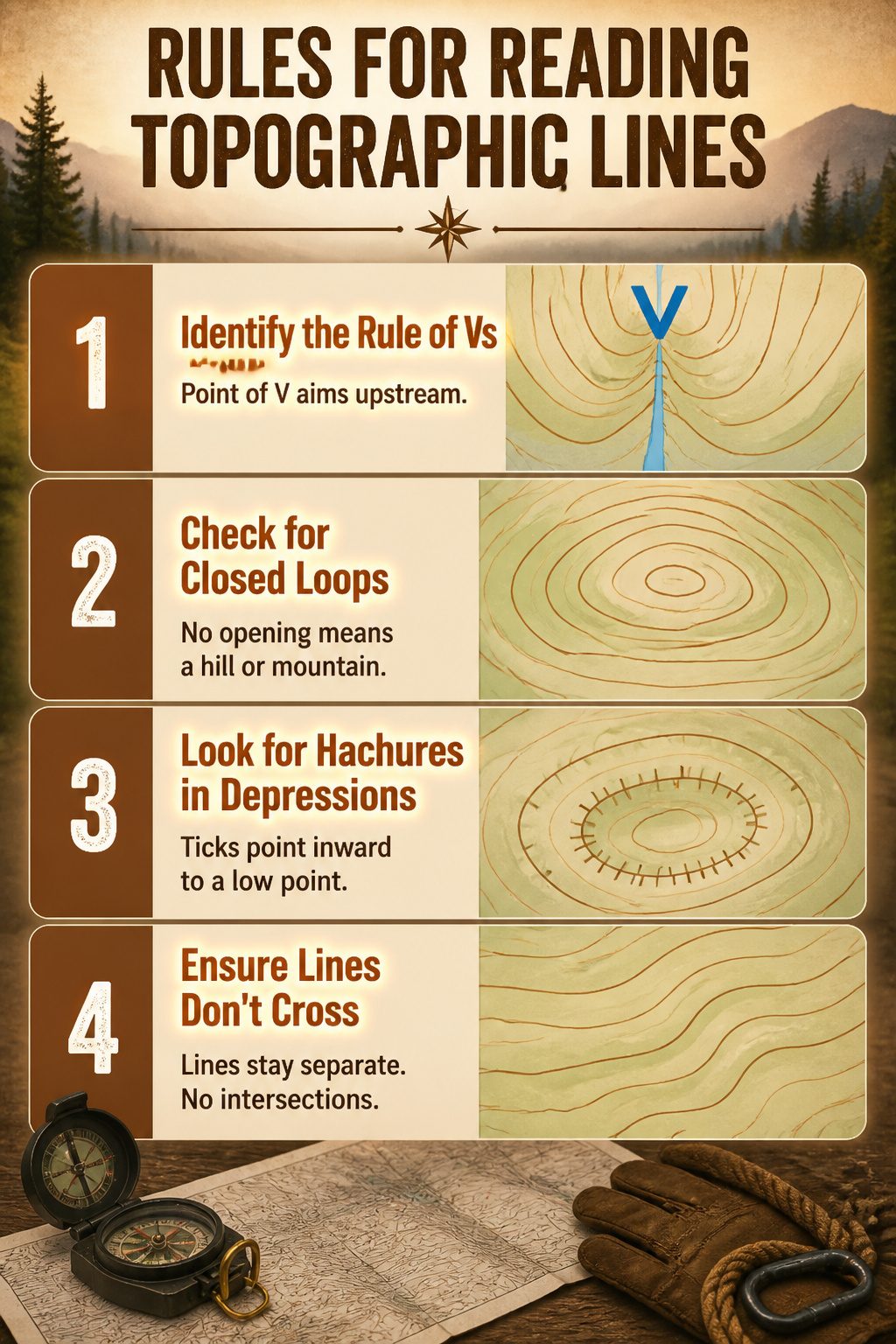
Two rules on a topographic map will keep you from reading terrain upside down. The first is the rule of Vs: when contour lines cross a stream valley, they bend into a sharp V, and the point of that V aims upstream. Erosion carves the valley so the land drops away on both sides of the water, which forces the equal-elevation lines to pinch together at the source. I misread this on a map once in the Appalachians and walked a ridgeline the wrong direction for twenty minutes before the drainage pattern made sense.
Closed loops tell the second story. A set of nested circles with no opening means a hill or mountain, with the innermost loop at the highest elevation. But not every closed loop rises. Depressions, sinkholes, or volcanic craters drop below the surrounding terrain, and the map marks these with short perpendicular ticks called hachures. These lines point inward toward the low point, the opposite of a hill. One glance at whether the ticks exist keeps you from mistaking a basin for a summit.
Contour lines also never cross each other. Two different elevations cannot occupy the same ground, so the lines stay separate except where a cliff or overhang forces them to stack, which the map shows as merged or touching lines rather than an intersection. That single constraint, held in mind, catches a lot of misreadings before they turn into wrong turns.
Slope Steepness From Spacing Alone
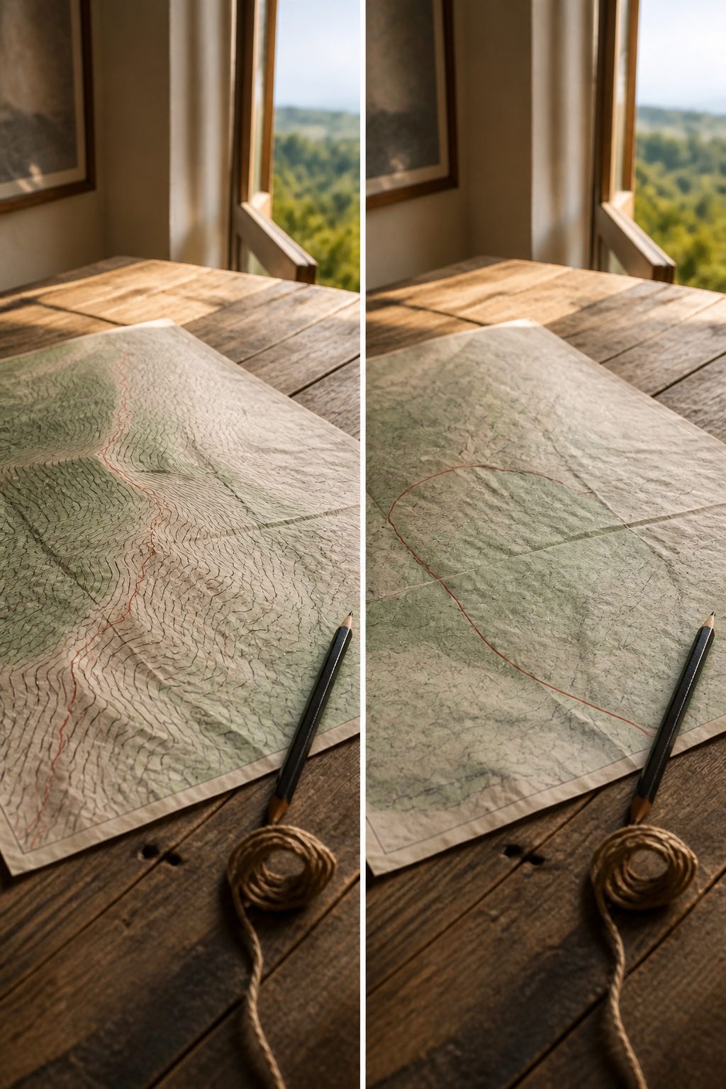
Tight contour lines mean a cliff you might not want to climb; wide ones mean a stroll you could probably manage in loafers. The spacing does the talking once you know the contour interval printed in the margin.
Last fall I was picking a route up a ridge in the Catskills, working from a 7.5-minute USGS quad with a 20-foot interval. The east face showed lines packed four to a hundred feet of horizontal map distance. The west face spread the same four lines across maybe four times that ground. I went west. The east would have been class-three scrambling in spots; the west was a steep walk with one hand on rock now and then.
Contour lines that crowd together mark the steepest ground on the map. A single tight band can hide a waterfall, a talus slope, or a cliff band that will stop you cold. Where the same lines drift apart, you are looking at benches, old lake beds, or a gentle valley shoulder that might make your camp.
The pattern also reads directionally. Lines bending uphill form a re-entrant, a gully that gathers water and often brush. Lines bending downhill form a spur, usually drier underfoot. Neither shape needs elevation numbers to identify; the spacing and curve together tell the story.
Closed Contours: Hills, Mountains, and Sinks
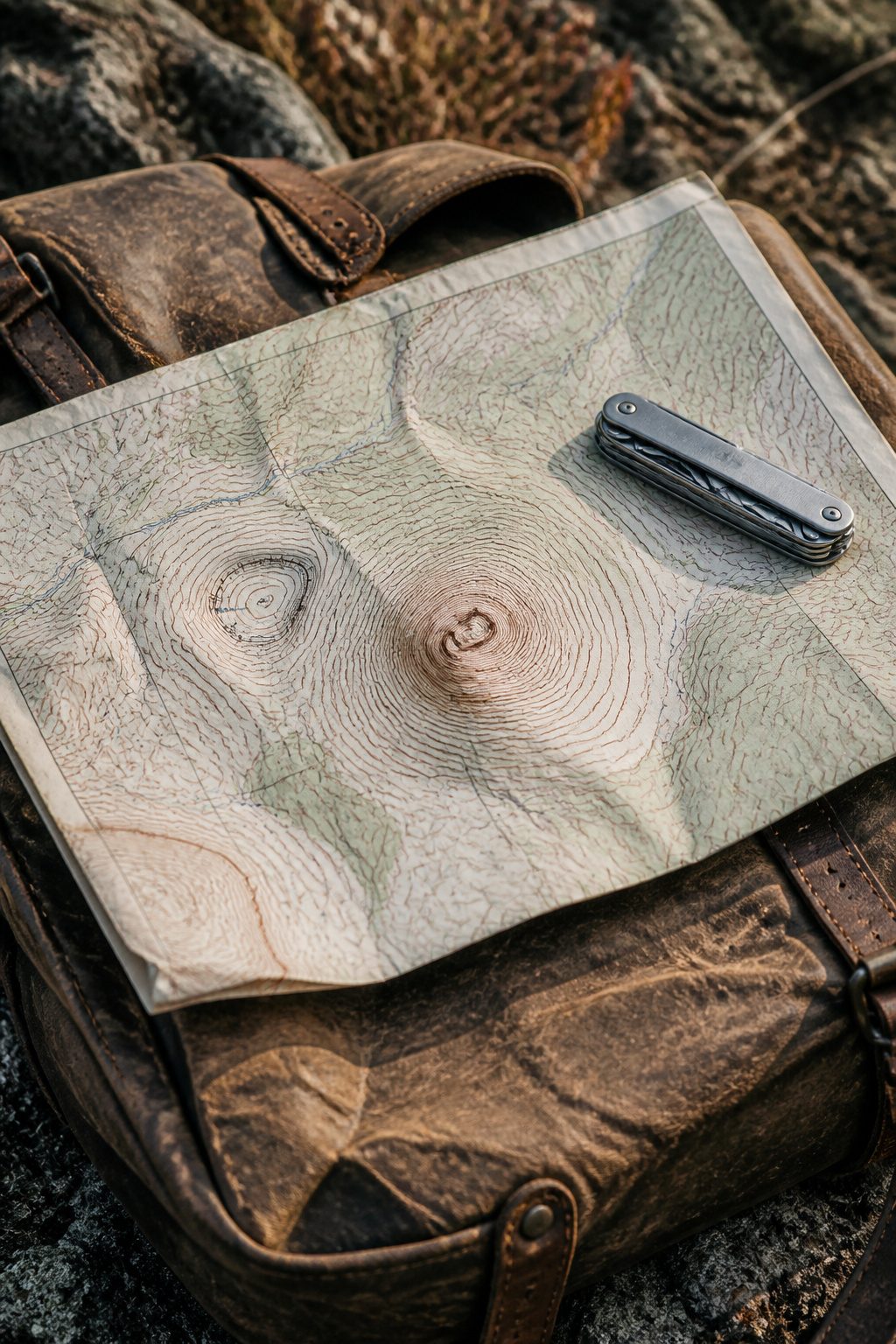
A closed loop on a topographic map is normally uphill on the inside and downhill on the outside, with the innermost ring marking the highest point. Hills and mountains read the same way; only scale separates them. The concentric circles tighten toward the peak like a target, and once your eye learns that rhythm, you spot summits from across the map without thinking.
Depressions break the rule. Sinks, volcanic craters, quarried pits: their closed contours look identical at first glance, but hachured lines mark the difference. These short perpendicular ticks point inward, toward the low, and the spacing still tells you slope steepness. I missed a sink once on a desert hike in Utah, mistook it for a small hill, and walked an extra half-mile to a dry camp that held no water and little shade. The hachures were there; I had not yet trained myself to check for them automatically.
Now I scan every closed contour twice: once for elevation numbers, once for ticks. Two seconds that can reroute a whole day.
Building a Topographic Profile
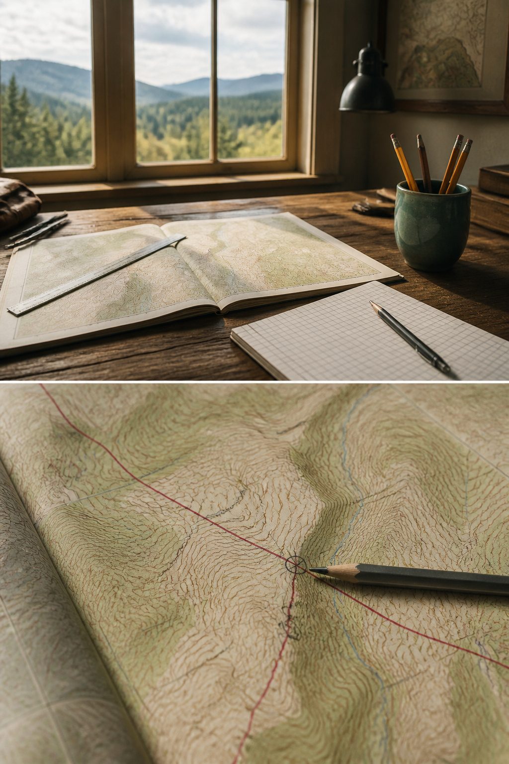
A topographic profile is a cross-sectional view along a specific line drawn across a map, like slicing through a cake and looking at the vertical face of the cut. Flat contour lines can hide what a slope actually feels like underfoot; the profile pulls that third dimension back into view.
Drawing one takes a ruler and a piece of paper. Lay the paper’s edge along your chosen line on the map, mark every point where a contour line crosses it, then note the elevation beside each mark. Transfer those marks to a graph with distance on the horizontal axis and elevation on the vertical, and connect the dots. The vertical scale is usually stretched compared to the horizontal, which sharpens the relief into something readable. That stretch is your vertical exaggeration, figured by dividing the map’s horizontal scale by the profile’s vertical scale once both are in matching units.
The payoff shows up fast on the trail. A map might suggest a gentle walk between two points, but the profile can reveal a gut-punch climb tucked into that distance. I have caught myself assuming a ridge route would be easier than a valley, only to sketch the profile and see the ridge was steeper than the contour spacing alone let on. The profile does not replace the map; it interrogates it.
Calculating Gradient From the Map
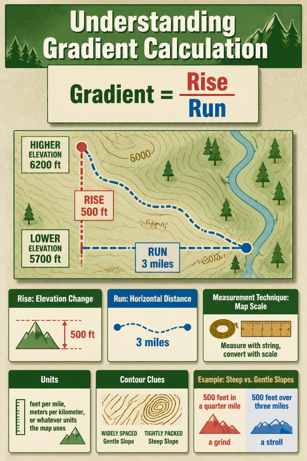
A quick way to put a number on slope is to divide the elevation change by the horizontal distance. On a topographic map, gradient equals rise over run: subtract the lower contour from the higher one, then divide by the ground distance between those two points. The result comes out as feet per mile, meters per kilometer, or whatever units the map uses, and it tells you exactly what your legs are in for.
The wrinkle is measuring that horizontal distance accurately. A straight ridgeline is simple enough with a ruler and the map scale. Rivers and trails bend, though, and a straight-line measurement cheats you into a steeper gradient than the terrain actually delivers. What works for a curving path is laying a string along the route, marking the length, then stretching that against a ruler and converting through the scale.
Steep ground shows up where contour lines bunch together, but the gradient calculation turns that visual guess into something you can compare trip-over-trip. A slope that gains 500 feet in a quarter mile is a grind; 500 feet over three miles is a stroll. The math takes maybe two minutes at the kitchen table, and it has saved me from misjudging a route more than once.
Where Contour Lines Came From

Contour lines first showed up in the late 1700s, though the method took decades to catch on. A French engineer named J.L. Dupain-Triel gets credit for the earliest known topographic map contour lines, drawn on a 1791 chart of France. The British Ordnance Survey adopted the technique around 1843, and by the 1880s the U.S. Geological Survey was using it for the maps that would define American cartography for the next century.
What made the method stick was simple: contour lines are the most efficient way to show three-dimensional terrain on a flat page. Early USGS maps between 1884 and 2006 were compiled, drawn, and edited by hand from direct field observations. That process was expensive and slow by any standard, which is why the agency dropped it in 2009 for the automated US Topo series. The tradeoff is real: the old hand-drawn maps took years to complete but captured subtle features a computer algorithm threading contours through a network of observation points might smooth over.
Contour Intervals in Real Maps
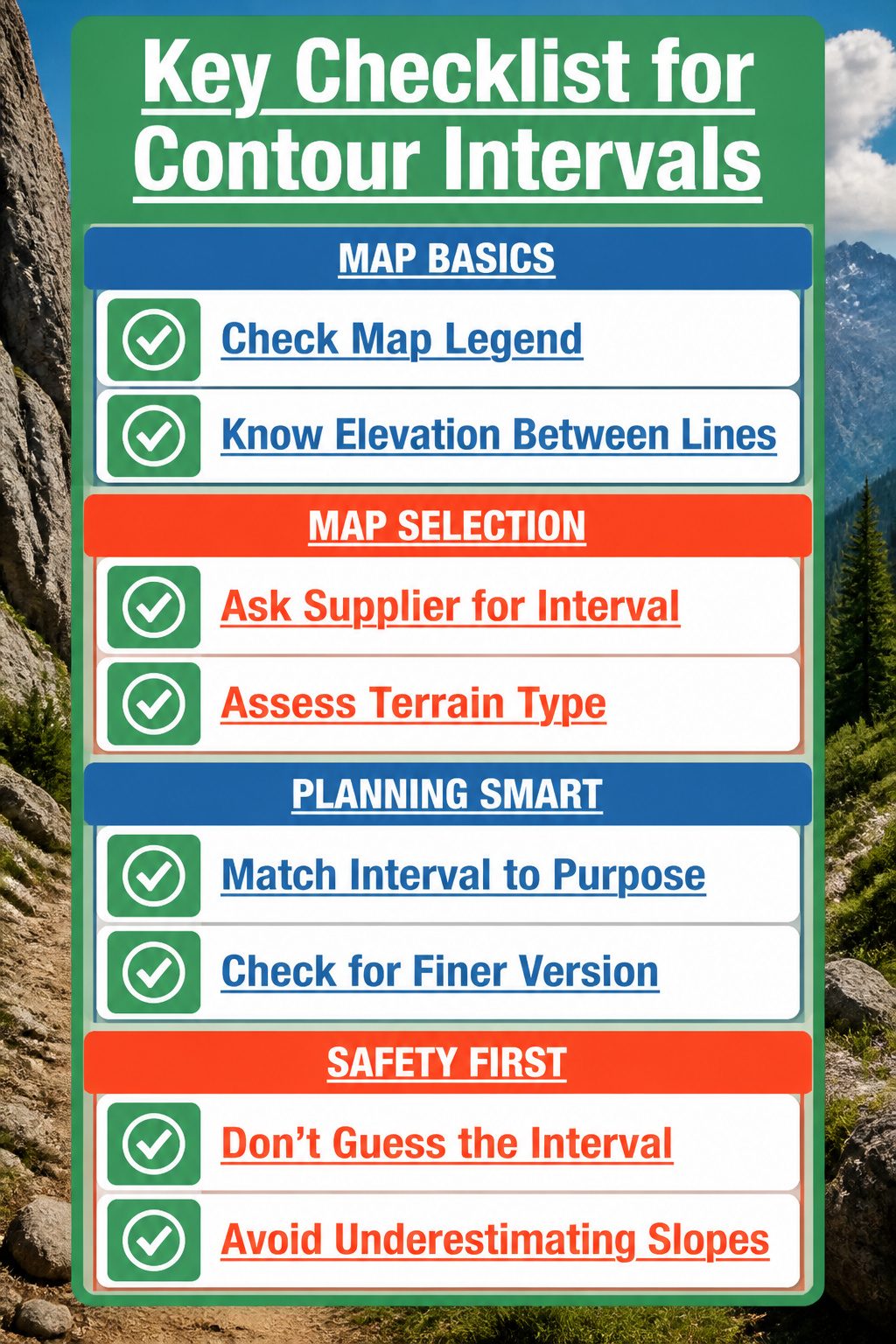
The contour interval, printed in the map legend, tells you exactly how much elevation sits between each brown line. On one map it might be five feet; on another covering the same county it could be twenty. The difference matters because a tight stack of 5-foot lines screams a cliff, while the same visual stack at 20-foot intervals might just be a steep but walkable slope.
What convinced me, reading through a dozen of these legends, is how rarely anyone points to the actual number before sending a hiker out the door. The interval choice depends on the map’s purpose and the terrain it covers. Flat farmland needs a fine interval to show any relief at all; rugged mountains get a coarse one or the sheet turns into unreadable spaghetti.
Check the legend first, every time. The interval there changes what the spacing means, and guessing wrong has sent more than one person up a grade steeper than the lines made it look. If you’re buying a map for a specific trip, ask the supplier what interval they used and whether a finer version exists for that area.
Beyond the Basics
Topographic map contour lines do more than keep hikers on the right ridge. In environmental science, the same lines that show a slope to your eye let hydrologists model where rainwater will pool, speed up, or carry sediment after a storm. The spacing between lines becomes a dataset: software can derive whole watershed boundaries from a dense contour map without anyone walking the terrain.
Urban planners use these maps early, before a single survey crew boots up. A tight cluster of lines near a proposed development site signals grading costs that preliminary budgets often miss. Flattening a slope, or building around it, changes the engineering entirely. Contour lines also reveal natural drainage channels that pavement would block, which matters for flood risk assessments and where to place retention ponds.
What surprised me, reading through planning guides, was how often the same 10-foot interval map serves both field biologists and city engineers. The difference is the overlay: soil type, impervious surface rules, or endangered species habitat. The contour lines underneath stay constant; the questions you ask them change.
Frequently Asked Questions
What is a contour line?
A contour line is a line on a map that connects adjacent points of equal elevation. Unlike shaded relief or color bands that paint whole zones in broad strokes, one contour line traces exactly one height across ridges, valleys, and flat ground alike. The line bends where the land bends, tightens where the slope steepens, and runs straight only when the grade holds steady in one direction.
How do you read contour lines?
Contour lines never cross each other, and their spacing tells you slope steepness. Tight lines mean steep ground; wide spacing means gentle grades. When contour lines cross a stream, they form a V that points uphill. Closed loops without marks mean hills or mountains, while hachured ticks pointing inward mark depressions.
What is a contour interval?
A contour interval is the vertical distance between any two adjacent contour lines on a topographic map. A smaller interval packs more lines into a slope and shows finer detail; a larger interval cleans up broad areas but swallows smaller features. The interval is printed in the map margin and varies by map scale and terrain.
What do closed contour lines represent?
Closed contour lines normally represent hills or mountains, with the innermost circle marking the highest elevation. However, closed loops with short perpendicular ticks called hachures mark depressions, sinks, or volcanic craters instead, with the ticks pointing inward toward the low point. Checking for hachures takes two seconds and can reroute a whole day.